The Guide is divided into five sections:
 Overview
The Overview provides you background design theory and visual perception. The Overview also describes how these principles apply to Windows, standards for screen design, and the use of colour and fonts.
Windows 3.x System Visuals
The Windows 3.x System Visuals section describes screen elements provided by the system (Windows). These elements (including buttons, title bars, window frames, and minimise/maximise buttons) combine to create the look and feel of the Windows interface and are a baseline for the design of application screen elements.
Application Visuals
The Application Visuals section includes some graphic elements of an interface not pre-defined by the system, including graphic buttons, toolbars, toolboxes and cursors. Applications Examples at the end of this section presents the most current application interfaces within the Windows 3.x standards.
Icon Design
The Icon Design section discusses icon design standards and outlines methods and tips for designing icons.
Resolutions
The Resolutions section describes PC screen resolutions.
In addition, visuals include emotional cues that motivate, direct or distract. We tend to describe graphic information with adjectives like "slick," "pretty," "boring," "conservative," and "wild." The advertising industry has taken advantage of this phenomenon for almost as long as publications have existed.
A study conducted in the early stages of Macintosh development compared a set of tasks performed on both the Lisa and a MS-DOS- based computer. These tasks were actually more complicated on the Lisa, but subjects in the test perceived them as being as easier because the graphical interface made the tasks more fun. This is only one example of how visuals can motivate people.
Composition and Organisation
We tend to read screens from left to right and top to bottom in what is known as the visual processing arc. The eye is always attracted to coloured elements over black and white, to isolated elements over elements in a group, and to graphics over text. These are just a few of the principles that graphic designers apply to cluttered computer screens in an attempt to make the information in them more accessible.
It's important to remember that all visuals influence one another. Good design depends completely on context. And, in a graphical user interface, a graphical element and its function are completely interrelated. A graphical interface needs to function intuitively the way it appears: it needs to look the way it works and work the way it looks.
Be sure to involve a graphic designer in the early stages of your product development. A graphic designer can help you visualise the elements of your product and contribute ideas that help motivate the user and organise the information more clearly.
Windows Principles
A few simple unifying visual principles form the basis of the Windows 3.x visual interface design. They involve the use of tactile visual properties, contrast, colour, and fonts.
3-D Can Be Acted Upon
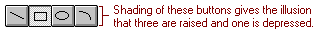
In Windows 3.x, three-dimensionality is used to emphasise function and to give actions real-world feedback. Anything that appears to stick up from the window surface can be pressed, or acted upon. When the button is pressed, it pushes in, giving the user powerful feedback. Elements that appear to recede are either static or inactive.
Much careful design and usability testing have gone into the 3-D appearance of Windows 3.x. It is very important to use the designs in the Windows 3.x System Visuals and Application Visuals sections of this Guide for consistency with other applications and the system.
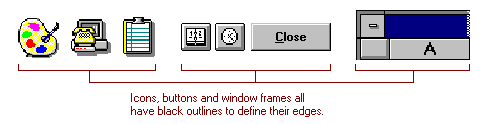
Black Outlines for Crispness and Contrast in Low Resolutions
The target market for windows 3.x is VGA resolution computers. Because of this and our limitation to 16 colours, we use black lines to define edges in Windows. Icons have black outlines, as do the window frames, buttons and controls. The two shades of grey available don't provide enough contrast to be seen in VGA. Single- pixel grey lines are hard to focus on and cause both eyestrain and reading difficulties. Icons have black outlines to emphasise the icon shape for quick scanning and locating.
In addition, since we have only two shades of grey, we use both black and white as highlight and very dark shadow colours to produce an effective 3-D appearance. We need all four (white, light grey, dark grey, and black) to create a clear 3-D appearance.
Icons, buttons and window frames all have black outlines to define their edges.
Colour Basics
How We See Colour
The eye can distinguish millions of different colours, but colour vision can be broken down in to a few simple concepts.
Trichromacy
The first concept is trichromacy. The retinas of our eyes have cones that perceive colour as red, green, or blue. Each colour in the visible spectrum can be reduced mathematically to groups of three numbers. These numbers were developed into international standards of colour perception in the 1920s by the Commission Internationale d'Eclairage in France, commonly known as C.I.E. An interesting wrinkle on the principle of trichromacy is that we have very few blue cones in our eyes and very few of them occur in the fovea, the focusing centre of the eye. We have approximately the same number of red and green cones.
Hue, Saturation, Brightness
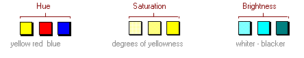
We classify colours in terms of three properties: hue, saturation (or chroma), and brightness (or value). Hue is the name of a colour, saturation is its intensity, and brightness is where it would fall on a scale of dark to light.
Opponent Colours Create Spaces
Colour also has spatial properties: we tend to see the edges of objects with our black and white receptors (rods) and then fill in the edges with colour. We always see colours in relationship to the other colours around them. This lead colour next to it. The red/green opponent cones contribute to our tendency to see colour in opposites, because we have difficulty focusing on both red and green at the same time. It is important to remember that about 10 percent of the adult male population has some form of colour confusion, with a small fraction of that being true red/green colour blindness.
Emotional/Psychological Properties of Colour
Colour improves learning. This has been proven in various psychological tests. Why? People like colour. Colour has emotional properties: red excites the eye, blue calms it. But everyone has a different taste in colour - some people love pink, others hate it. If colours are well chosen, they improve marketability and give an impression of friendliness. If they are poorly chosen they can severely affect usability and create a circus-like appearance.
Colour Recommendations
There has been much written lately about colour perception and computer screens, most of it not based on any appropriate scientific data. However, we can draw a few conclusions about how to use colour.
Use colour to show relatedness or grouping - for instance, we tend to see all the red things on a screen as belonging together. But we are slow to associate a colour with a meaning, e.g.: red means I'm in edit mode, green means I'm in read mode.
Opponent colours (like red and green) should not be used together because they appear to vibrate as the eye tries to focus on them. And bright colours tend to leave opponent after-images on the retina - stay away from large areas of bright colours.
Because of colour confusion, use colour as a redundant cue - don't rely on colour alone to indicate a property or function.
Use of subtle, not circus colours.
The default colours in Windows are deliberately subtle. Colour is used only to indicate activity or selection. The active, or selected, window has a coloured title bar, and colour is used to highlight selections much as highlighter pen is used. Colour attracts the eye, so it is good to use colour to direct attention, although many colours can become confusing. Context is critical. Blue is a poor colour for small, thin elements or small text, because it is hard to focus. But blue works very well as a background.
Colour is used in the icons very carefully. Too much colour is distracting, but people enjoy colour, and seem to understand iconic images better when they are coloured like their real-world counterparts.
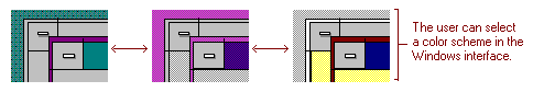
Also, since colour is a very personal thing, Windows 3.x tries to give users complete control over colour choices, by allowing them to change any of the Window element colours, or to choose from a set of pre-defined schemes that were designed to be usable, but suit a variety of tastes.
The user can select a colour scheme in the Windows interface.
Font Basics
Fonts have many functions in addition to providing letter forms for reading. Like other visual elements, fonts create a mood, motivate people, and organise information.
Fonts Organise Information
Fonts can create a hierarchy of information. By varying the size and weight of a font, we see text as more or less important and perceive the order in which it should be read.
Readability of Font Weights and Sizes
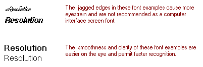
By the very nature of the computer screen, fonts are much less legible on-line than on the printed page. Generally, italic and serif fonts are harder to read because of the jaggies that result from too few pixels per character. Similarly, smaller, thinner fonts (one pixel width strokes) are harder for older people to read.
Fonts Used in Windows
Taking into account the principles described earlier as well as realistic technical‚I constraints, the following font choices have been made in Windows 3.x
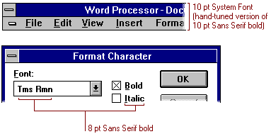
The System font, a hand-tuned bold version of the 10 pt sans serif, is used for title bars and menu text. This font must be bold so that it will still be visible when greyed in menus.
The font used in dialogs is an 8 pt Sans Serif bold font. The smaller font creates a hierarchy of information from the larger title font, and allows for more information to fit in the dialog box. Likewise, this font must be bold so that when it is displayed in grey or dithered to a checkerboard pattern (the inactive state) it will still be visible.
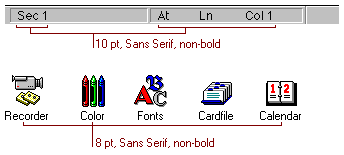
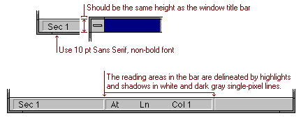
The font used in status bars is 10 pt Sans Serif, non-bold font. This text is easier to read and fits more compactly on a line than the bold version. This text never needs to be inactive and also indicates that the information is less important. The icon font is 8 pt Sans Serif, non-bold font. This is the smallest font available in Windows 3.x and yet is quite readable as icon text.
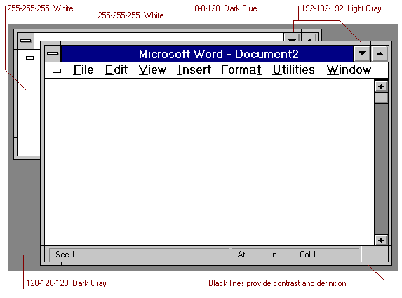
Three dimensions and the Grays The three-dimensional appearance of parts of the Windows interface are defined rigidly. We assume a light source coming from the upper left. 
The Frame
The default frame colour and all controls in Windows are black one-pixel lines. Black lines provide contrast and definition.
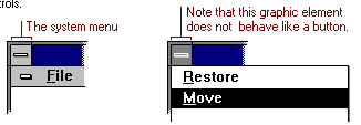
The System Menu
The system menu is not 3-D because it is a menu and not a button. When pressed, the background of the system menu reverses from light grey to dark grey and the black graphic reverses to white. This graphic menu, although it is light grey, is inconsistent with other elements of the interface and should not be used as a model for any other controls.
Colours
There are 16 system colours in VGA and four extra in 8514 or other 256-color displays, such as Super VGA, that are saved out of the palette. These colours always remain the same on the screen, even if there are also highly coloured bitmaps on the screen as well that use all of the colours available in the system. There are only 15 system colours in EGA because the hardware cannot make a light grey.
The 16 colours are:
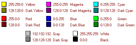
The Four Extra Colours in 8514 and Super VGA
There are four additional colours available in 8514 and in Super VGA: light yellow, light green, light blue, and a medium grey.
The default screen colours are:
When deciding which button category meets your needs and follows the Windows standards, ask yourself (1) where the button will be used (in a dialog box, on a toolbar, or on a form), (2) what is the result from pressing the button (another dialog box appears, a tool appears, a mode changes), and (3) how much screen real estate is available in your product. Then read each section description and locate the type of button that works for your situation.
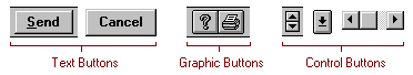
Text Buttons
Text buttons are generally located in only a few places within the Windows interface: in dialog boxes, on forms, or on toolbars.
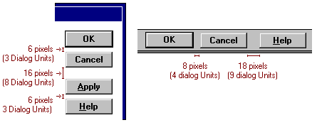
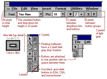
Text buttons in dialog boxes are usually a standard height of 10 Dialog Units (or 22 pixels), a unit that is determined by the font used. Windows 3.x system dialog boxes use the 8 pt Sans Serif bold font. Text buttons on forms or on toolbars can vary in height (typically 22 pixels) and also use the 8 pt Sans Serif bold font. If vertical space is a great consideration and aesthetics are not as important as the usability of the product, text buttons may be the best solution for a toolbar.
There are three states of text button appearance: up, mouse down or disabled. Text button states are provided by the Windows 3.x system. 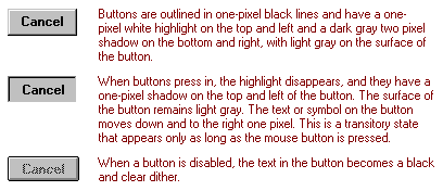
When grouping text buttons in a dialog box or on a form, use the spacing shown below.
In vertical layouts, use 6 pixels between buttons and 16 pixels between groups of buttons. In horizontal layouts, use 8 pixels between buttons and 18 pixels between groups of buttons.
Graphic Buttons
Graphic buttons are located on ribbons, rulers, toolbars, toolboxes, property sheets, and navigation controls. The graphic image on the button is limited to the 16(w) x15(h) pixel button surface area. The recommended standard button size for toolbars and toolboxes is 24(w) x 22(h) pixels. In special cases, when a smaller button is required due to real estate constraints, the next recommended size is 22(w) x 18(h) pixels with an image size of 16(w) x 12(h).
The graphic images themselves are simple. Usually black outline images with the occasional addition of white to enhance the visual appearance. The use of white is limited to within the black outline areas and must be solid (not dithered or checker-board).
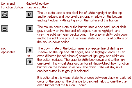
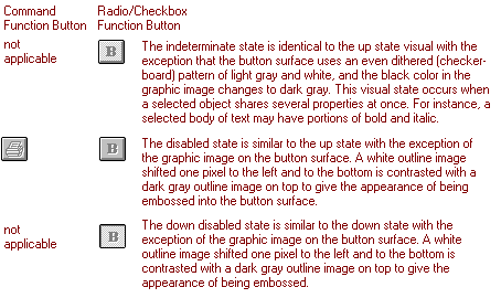
There are six possible states of graphic button appearance: up, mouse down, indeterminate, disabled and down disabled. These are states not provided by the Windows 3.x system and must be implemented with bitmaps. All buttons are outlined in one-pixel black lines.
All buttons have an up state. Graphic buttons that perform a command function when pressed, such as File Open or File Save, will require a mouse down state. All other button functions, including properties, will require a down state. The down state will stay pressed in until it is pressed again or another button in its group is selected.
It is important that there is one pixel of light grey around the perimeter of the button image. If the button image touches the white highlight or the dark shadow, the image won't sit properly on the surface and will get compressed even more in other screen resolutions. 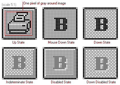
On occasion, a graphic button can include text with the image. The button size increases dramatically and can be dependent on the text length. Graphics and text together should be used where a product needs the aesthetic benefit of the graphics but where the graphics alone are not clear, and when vertical space is not a concern.
There are two recommended styles to choose from. In either case, the button size is dependent on the text length. 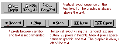
Horizontal layout using the standard text size button (22 pixels in height). Allow 4 pixels space between graphic and text. The graphic is always left of the text.
In those cases where a menu bar is not available due to real estate constraints, there are special menu buttons. These buttons are purposely two-dimensional to inform the user that the button is unique in function and to simulate the flatness that is characteristic of a typical drop down menu.
The menu button can either have text or a graphic, depending on the interface need. 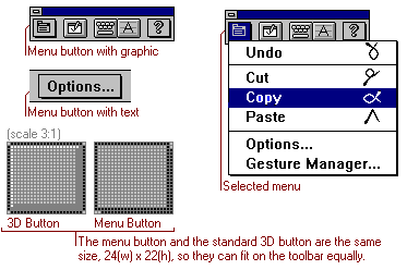
The menu button and the standard 3D button are the same size, 24(w) x 22(h), so they can fit on the toolbar equally.
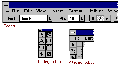
Toolbars and Toolboxes
Toolbars and toolboxes are quite similar in function but different in appearance.
Toolbars are the horizontal bars on the top portion of a window that contain tools, accelerator buttons, drop down lists, and sometimes status areas. Toolboxes are vertical bars either attached on the left side of a window or floating with their own miniature title bar and system menu button.
Both toolbar and toolbox variations are recommended, but the horizontal toolbar is generally the default option.
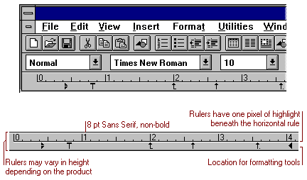
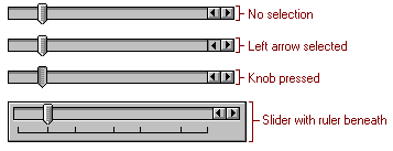
Rulers
Rulers are horizontal measurement bars on the top of the window. On occasion, a vertical ruler can accompany a horizontal ruler.
Status Bars
Status bars appear horizontally at the bottom of the window and contain prompt or status information. Sometimes locked key status is indicated with grey 3-D inset boxes.
Cursors
Cursors are sometimes known as pointers. These images give potent, immediate visual feedback to users about actions available in the interface. A well designed pointer draws the user's eye naturally to its hot spot, so that the user can easily and accurately position it.
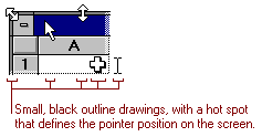
The arrow cursor has been enhanced to give more feedback during copy and move actions. The copy cursor has a plus symbol to the upper right, and the move cursor has a dithered box attached to the tail. In both cases, the hotspot is located at the tip of the arrowhead.

Other Controls
These are examples of two other controls that would be useful in applications designed to be consistent with the Windows 3.x interface.
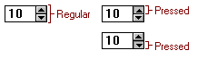
Slider
Spin Buttons
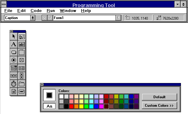
Application Examples Programming Tool
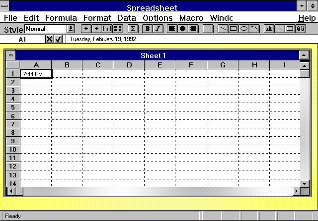
Spreadsheet
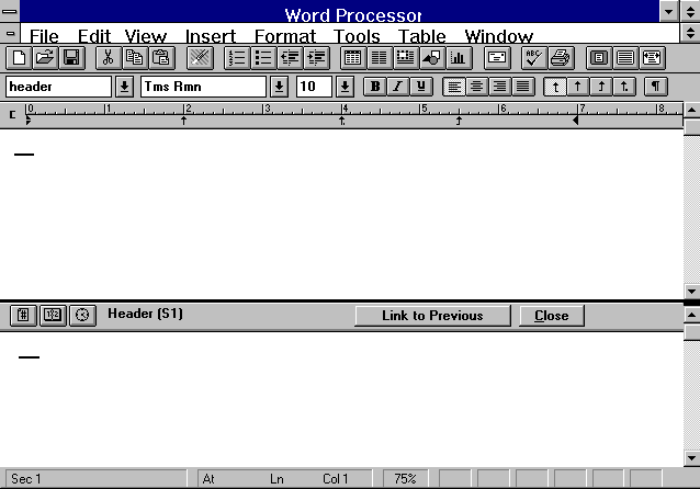
Word Processor
Use of Metaphor
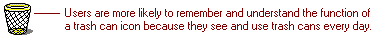
The most successful icons are based on metaphors. Metaphors communicate abstract concepts through concrete associations. By using real-world objects to represent abstract ideas, users draw from previous learning and therefore learn more quickly and with less effort.
Visual Vocabulary
When concepts are repeated throughout a graphical interface, it is important to establish a visual vocabulary. This means that recurring concepts should be reinforced by recurring icons.
Style
Icons that appear together should have a similar style. Establishing a general appearance minimises unnecessary distraction and allows the user to focus on content instead of style. The following screens briefly outline the basic process and stylistic guidelines for designing icons for Windows.
The Design Process -Idea
First, be sure to get a clear understanding of the icon's purpose and identify where the icon will be seen. Then brainstorm as many ideas as possible. As you brainstorm, concentrate on finding real- world metaphors that communicate the concept most clearly.
Work on the Computer
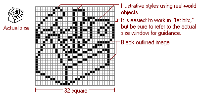
It's easiest to work directly on the computer. Pushing pixels is a very different process than drawing with a pen or pencil, and since icons ultimately are viewed on the screen, it's helpful to conceive them there. Also, the computer makes refinement through many variations easy because of its ability to copy and paste.
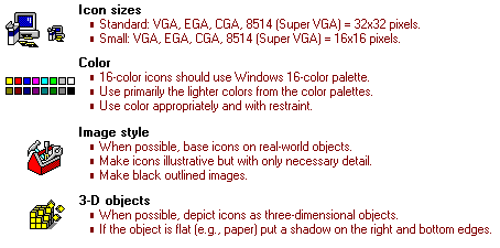
Sizes
There are currently two sizes of icons: standard and small. The standard icon size for all resolutions is 32x32 pixels. The small icon size for all resolutions is 16x16 pixels.
It is easiest to begin designing in VGA because of its square pixel resolution. But remember, because each resolution has a slightly different pixel height, icon proportions vary somewhat across the various platforms.
Use of Detail
Windows has adopted an illustrative rather than symbolic icon style. Illustrative icons communicate metaphorical concepts better than abstract symbols. This is because users make basic functional assumptions about icons based on familiar real-world objects, whereas symbolic icons have to be learned from scratch. But be careful to use only the appropriate amount of detail when designing illustrative icons. Unnecessary decoration obscures rather than clarifies an icon's meaning.
Start in Black and White
Always begin designing in black and white. Introducing colour too early can weaken a design. Remember, if an icon looks good in black and white, it will look better in colour. Start by drawing the icon with a black outline. Black outlines assist shape recognition, and help to ensure that the image will be visible on a variety of backgrounds.
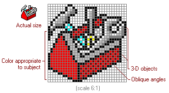
3-D Objects
When possible, depict icons as three-dimensional objects. This strategy enhances recognition and improves communication. The available area, 32x32 pixels is not a lot of room when you think of its as a flat plane. But if you think of the space as a cube, the possibilities are much greater. One way of utilising this third dimension is to depict objects at angles. Employing oblique angles makes your icons more dynamic.
Colour
After you have established the general shape, colour can be applied. Be careful to apply colour appropriately and with some restraint. Colour in icons should enhance, not detract from the icon's meaning. The 16 colours available for icons are those used on VGA in Windows.
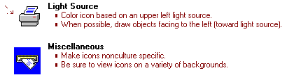
Light Source
To produce the 3-D interface of Windows, we assume a light source coming from the upper-left corner of the screen. Icons should also comply with this standard. For this reason it is a good idea to orient 3-D icons to the left instead of the right, so as not to place the front of the icon in the shadow.
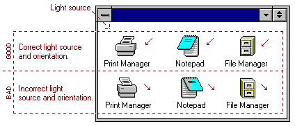
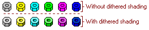
Also, apply colour consistently with this model. If you identify highlights and shadows, the highlight colours should be on the top and left sides, and the shadow colours should be on the bottom and right sides. To create a range of shadow colours, use dithers.
Things to Remember
Proportions
Try to use proportions in icons that are appropriate for the viewing distance and resolution. For example, fingers on hands look better if the fingers are not true-to-life, but "true-to- icon."
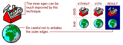
Anti-aliasing
Anti-aliasing is a technique to reduce the stair step or jagged appearance of an image. This is done by placing shades of a colour (in this case grey) next to the original colour to give a cleaner appearance. When this technique is used on outer edges of an icon, it should be done sparingly so that the image can sit well on any background colour.
Backgrounds
Remember to try your icon designs on a variety of backgrounds. They will not always be seen on white or grey.
General Icon Specifications
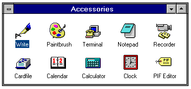
Icon Examples
PC Monitor Dimensions
Monitor Type    Size           Number of Colours
VGA             640 x 480      16 colours
Super VGA       640 x 480      256 colours
                720 x 540      16 and 256 colours
                800 x 600      16 and 256 colours
                1024 x 768     16 and 256 colours
8514            1024 x 768     256 colours
EGA             640 x 350      16 colours, no light grey
Monochrome      640 x 480      Black & White